
Paul Shortt
Size: 11x17 inches
Edition Size: 40
Medium: Risograph
Paper Type: Neehan Neenah Exact Vellum Bristol, 67lb, bright white
$25
_____________________________________
About the Poster:
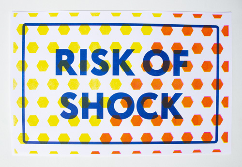
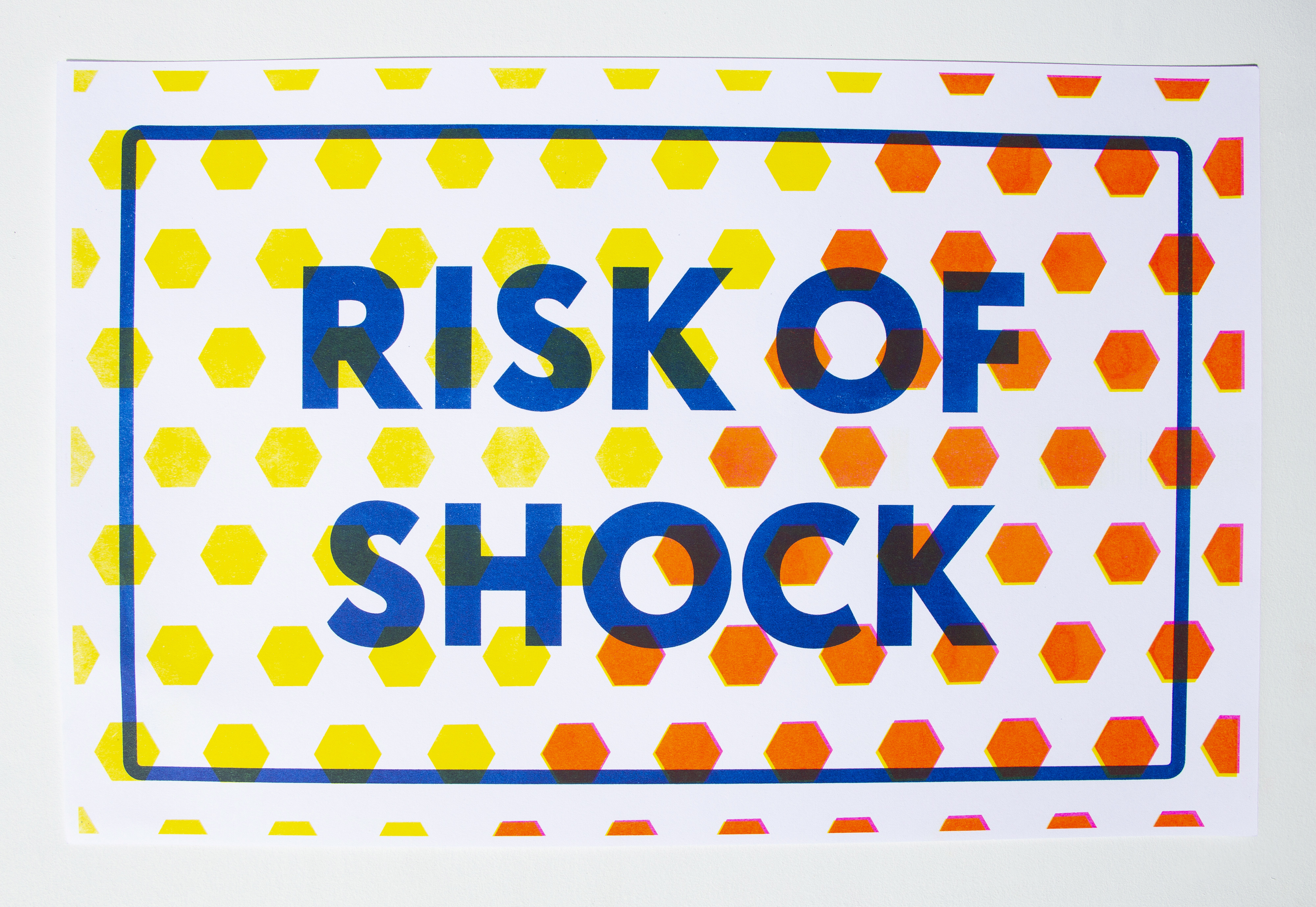
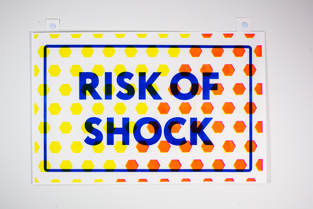
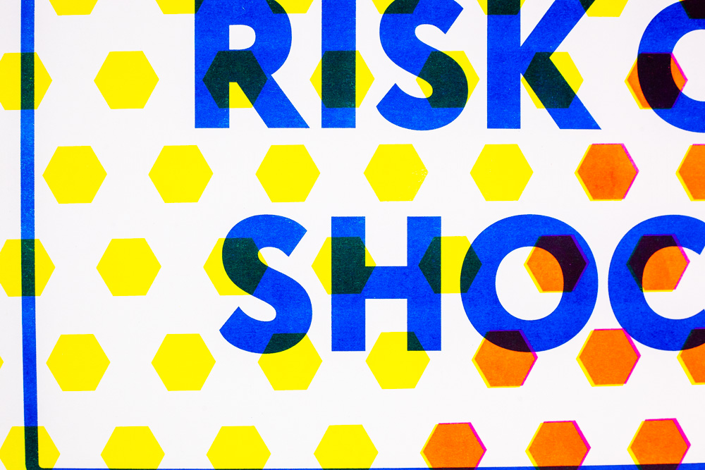
Over the last five years I’ve been exploring the language of street signs focusing on texts that I create and appropriate. This investigation has led to print and signed based public artworks that explore time, authority, public space and adulthood. The majority of these works have been made into multiples for a public audience, in the hopes that the ideas of questioning authority and the status quo can spread to viewers and create agency. My intent with creating this agency is to give control over the text to the viewer to create meaning. A central component of this exploration has been taking apart both the material and formal elements that create a sign, and reimagining them. I use lines, dots, and geometric patterns in bright colors such as yellow, and pink to mimic the reflectiveness of street signs. The text I appropriate falls into categories of time, emergencies, warnings and other means of denying a thought or action. The text I invent for my signs comments on social and financial inequities in public and private spaces, and invites playful action. These texts combined with my use of bright colors and patterns turns something negative and instructional into something playful and ambiguous, which is further amplified by the context of the signs. This sign exploration has led to prints, gallery installations, works on paper and public art works using physical signs and sign making materials to reimagine and start arguments not just about what signs are, but about the environment and actions they seek to control.
______________________________________
About the Artist:
Over the last five years I’ve been exploring the language of street signs focusing on texts that I create and appropriate. This investigation has led to print and signed based public artworks that explore time, authority, public space and adulthood. The majority of these works have been made into multiples for a public audience, in the hopes that the ideas of questioning authority and the status quo can spread to viewers and create agency. My intent with creating this agency is to give control over the text to the viewer to create meaning. A central component of this exploration has been taking apart both the material and formal elements that create a sign, and reimagining them. I use lines, dots, and geometric patterns in bright colors such as yellow, and pink to mimic the reflectiveness of street signs. The text I appropriate falls into categories of time, emergencies, warnings and other means of denying a thought or action. The text I invent for my signs comments on social and financial inequities in public and private spaces, and invites playful action. These texts combined with my use of bright colors and patterns turns something negative and instructional into something playful and ambiguous, which is further amplified by the context of the signs. This sign exploration has led to prints, gallery installations, works on paper and public art works using physical signs and sign making materials to reimagine and start arguments not just about what signs are, but about the environment and actions they seek to control.

image by Maxine Worthy